
Redefining File Search & Knowledge Retrieval with AI
Hyperlink is an AI-powered knowledge assistant that launched in July 2025, helping users search and reason with documents in one flow. Built at Nexa AI, a startup creating private on-device AI agents, it reached 6K+ users in its first month.
As founding design lead, I initiated and owned the end-to-end design, shaping Hyperlink into a tool that saves users hours each week.
3+
hours/week saved for active users
6k+
Early test users
File Search Today Is Either Fast but Shallow, or Smart but Slow
System tools like Finder or Spotlight Search are quick but only surface files by name. AI tools like ChatGPT can analyze content deeply but require users to upload files one by one, slowing workflows. For knowledge workers, this tradeoff makes retrieving and working with files both inefficient and frustrating.
Bridging Shallow Speed and Isolated Intelligence
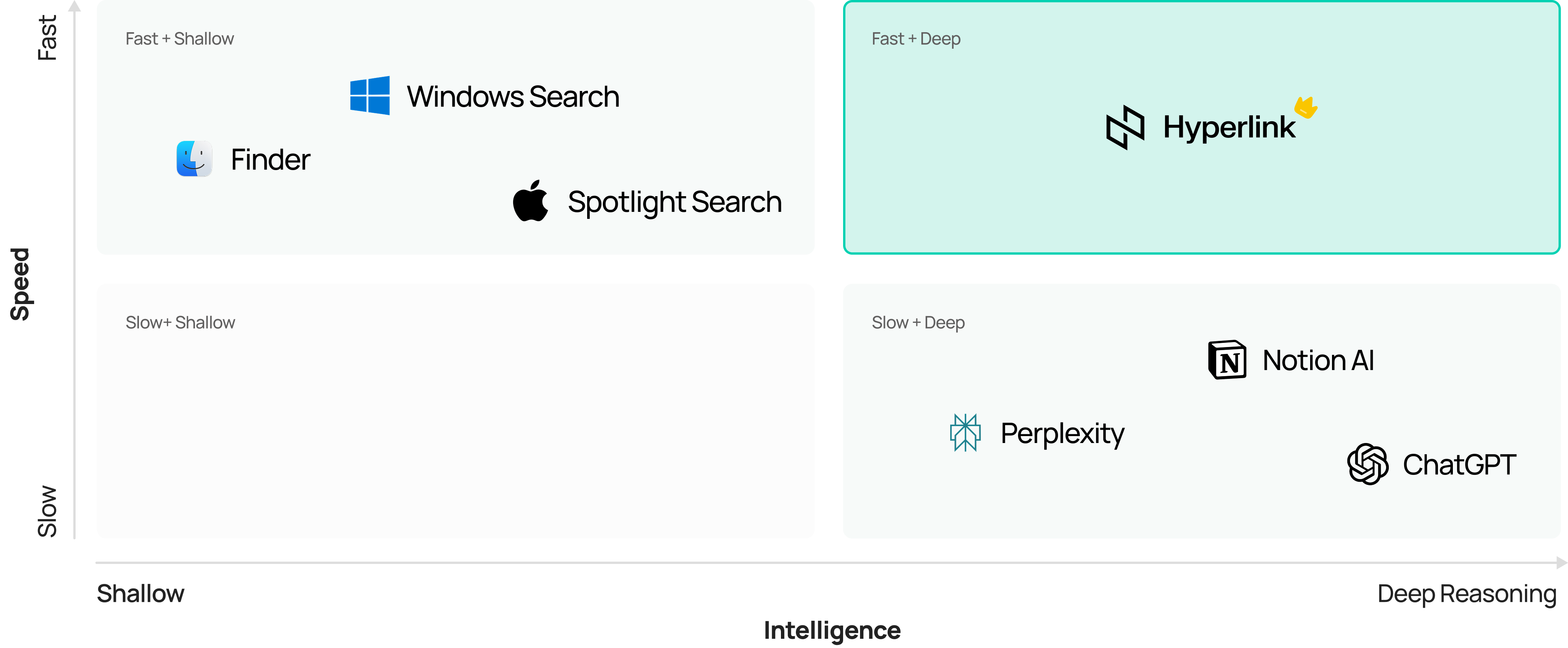
How might we help users find and understand files both quickly and deeply?
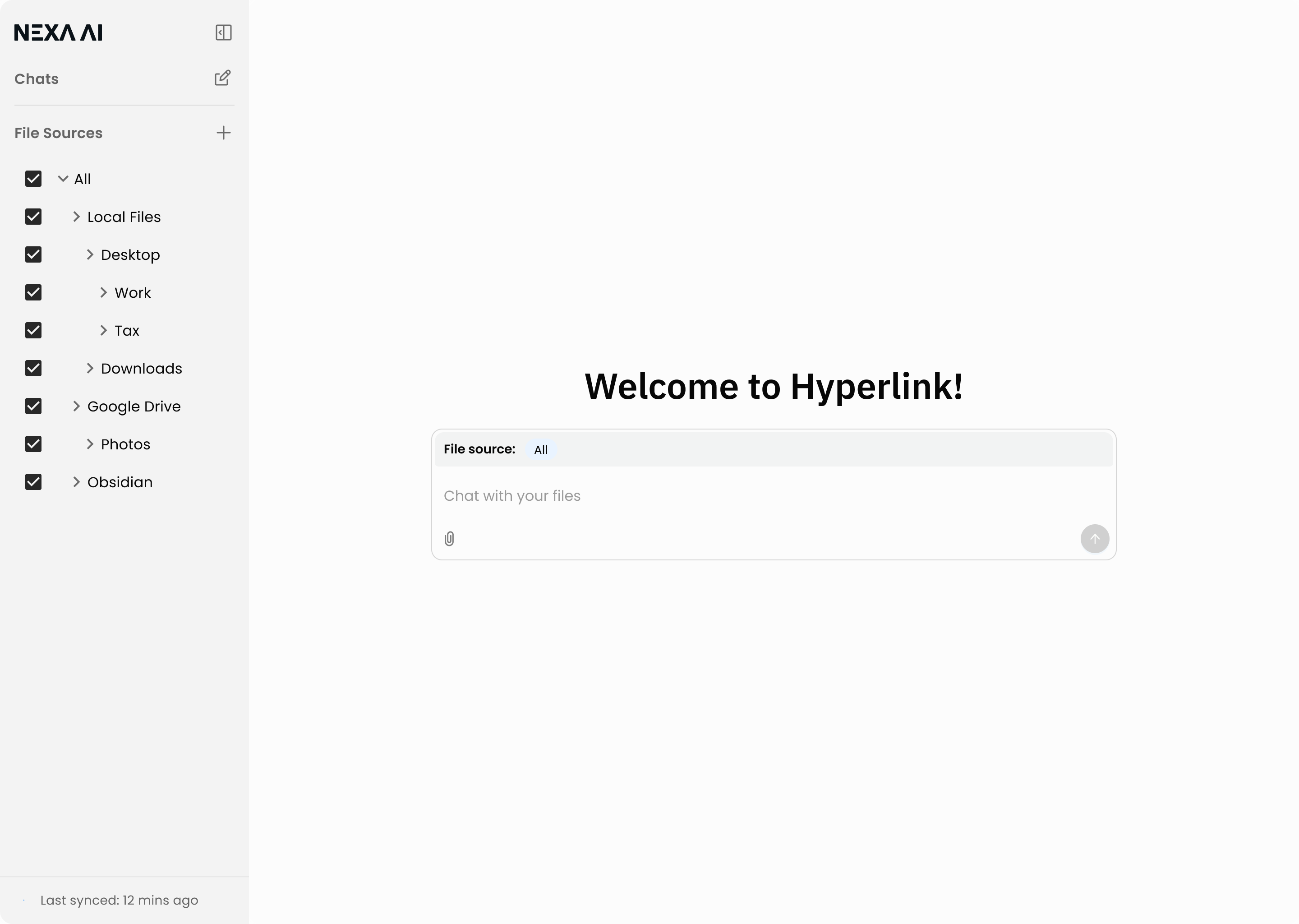
An AI Assistant That Searches and Works With Your Files
Hyperlink unifies search and reasoning into one continuous flow, turning fragmented file search into a seamless experience.
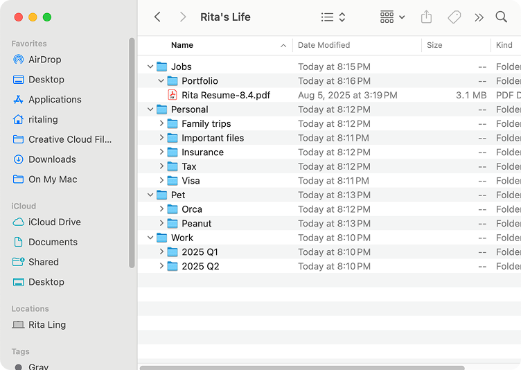
Controlling File Sources with Familiar Tree Structures
@Mention Search to Instantly Add File Context
Visible AI Reasoning to Build User Trust
Inline Citations for Transparent, Verifiable Answers
Why We Started with Document Search at Nexa AI
Nexa AI set out to build on-device AI agents designed for privacy and seamless workflows. Among many possible directions, we chose to start with document search because it represented both a universal pain point for knowledge workers and a perfect match for our technical differentiator: private, fast, local AI. Hyperlink became the first product to embody this bet.

From Market Gap to User Reality
System Tools Are Fast but Shallow, AI Tools Are Smart but Isolated
To validate this opportunity, I conducted both market and user research to understand where existing tools fall short and what users truly need. I ran a competitive audit across system tools and AI assistants, evaluating them on coverage, transparency, trust, and control. This analysis highlighted that while tools excel in isolated areas, none combined speed and intelligence in one seamless flow.

While the competitive audit revealed clear gaps in the market, I needed to understand how real users search, where they struggle, and what they expect—leading us to primary research.
Users Struggle with Scattered Files, Opaque AI, and Confusing Workflows
I conducted 50+ user interviews and mapped common document search workflows. This revealed three recurring pain points: scattered files across local and cloud, lack of AI transparency, and dual needs for quick retrieval vs. deep exploration.

Today’s Search Workflow Is Fragmented, Manual, and Hard to Trust
I mapped users’ existing workflows to uncover inefficiencies and pain points, highlighting where AI could make the most meaningful difference.

Turning Pain Points into Design Principles That Directly Shaped Our Features
I translated the pain points from the journey map into clear design directions, then defined principles to guide solution exploration. Each principle directly connects to the features we later designed and tested.

Precision Control
Users need flexible scope selection across local, cloud, and enterprise files.

Seamless Flow
Searching, retrieving, and reasoning should happen in one continuous experience.

Clarity & Trust
AI’s reasoning must be visible and verifiable, so users can trust the results.

Scalable Context
The system should support both quick lookups and deep analysis in one flow.
Controlling File Sources with Familiar Tree Structures
Users don’t just want to know where a file lives—they need to control which sources the AI looks at, so answers stay relevant, precise, and compliant. Without scope control, results are noisy, unfocused, and sometimes non-compliant.
Ideation
I started by simulating how users naturally choose files in their daily workflows.
Mimicking user’s mental model of file selection
Balancing visibility and importance
Usability Testing
When testing this first version with knowledge workers.

What went well

Users immediately noticed the scope bar and grasped its purpose.
They quickly learned how to toggle between local, cloud, and enterprise sources.

What could be improved

Source selection was reported as an occasional need rather than a frequent task.

The persistent bar felt visually heavy when not actively used.
Iteration
Based on these findings, I evolved the design.
Before

Disorganized visual weight.
After

Balanced discoverability with contextual simplicity.
Prototype
Adding Files into AI Context with Simple @Mentions
When users needed multiple files in context, they had to type full filenames into prompts, which is tedious and error-prone. At the same time, they wanted a single entry point to quickly bring files into context (search) and keep them active during deep discussions (chat). Without this, workflows broke: either too slow for quick lookups, or too rigid for multi-file analysis.
Learning from Familiar Patterns
By studying how Slack uses @ to mention people, I realized users already associate @ with precision targeting. Translating this mental model into Hyperlink, I reimagined @ as a way to pinpoint files or folders in the AI's context.
Slack
@ = calling out people → mental model of precision

Hyperlink
@ = calling out files → mental model of contextual control
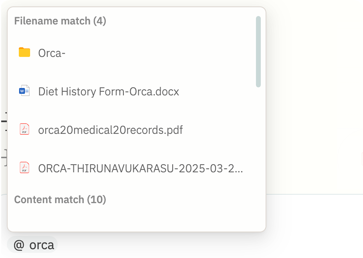
This insight shaped our initial flow: @ → search → add.
From Testing to Iteration
Testing revealed gaps in clarity and recall, leading to refinements that improved both discoverability and usability.
I tested the first version with real users:
Users quickly recognized the @ pattern, finding it intuitive for single-file cases.
Some confused @ with “mention” rather than “add,” while others struggled to recall exact file names.
Before

After


These improvements clarified the feature’s purpose, made it flexible for different workflows, and increased adoption among testers.
Prototype
Showing AI’s Reasoning Step by Step to Build Trust
From black box to transparent partner — building trust through visibility
From Black Box to Transparency
The goal was to make AI feel less like a mysterious black box and more like a partner users could trust. My first design showed high-level steps but didn't reveal what exactly was happening. Users felt disconnected from the AI's process.

"How do I know the AI is reading the right files?"
"If it's wrong from the start, doesn't that mean the final answer will also be wrong?"
Trust Gap: Users felt powerless to intervene early
Learning from Human Assistants
A human intern wouldn't just say "I'm searching". They'd break down their process step by step.


Prototype
Unifying Quick Lookup and Deep Dive with Inline Citations
Two Modes for Two Needs
In the early stage, I designed a toggle in the search bar to let users switch between two modes. The goal was to give users control over how they wanted to search.
Quick Lookup
A fast, shallow search experience for simple queries, mainly for looking for files.

Deep Dive
A detailed exploration where inline citations pointed to sources, numbered sequentially.

Complexity vs. Intuition
Through user testing, I found two critical insights.

Too Complex
Users didn’t want to actively choose between modes; they preferred a single, intuitive flow.

Verification Matters
Users wanted answers that could be directly cross-checked with sources, instead of trusting the AI blindly.
“I don’t want to think about toggling. I just want to ask, and then decide whether I need more detail.”
One Entry, Two Layers of Depth
Based on this feedback, I unified the design into a single entry point that seamlessly supports both quick search and deep dive.
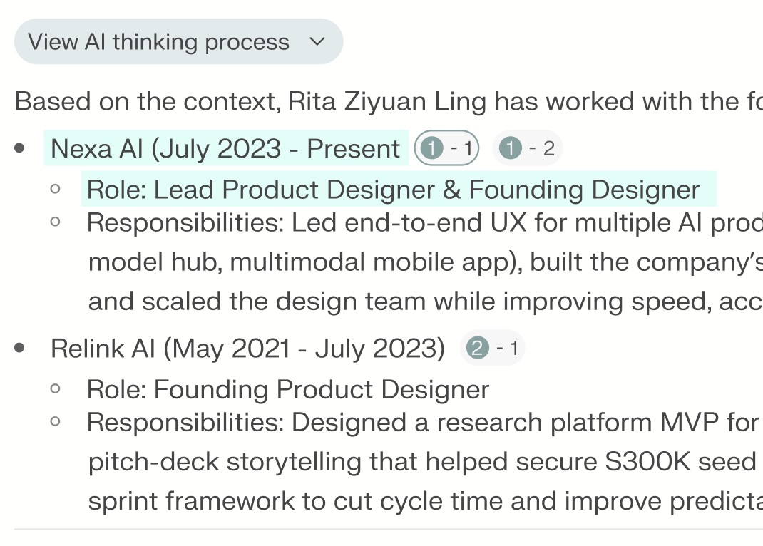
Split Screen Layout
Results are displayed side by side, with AI-generated text on the left and supporting files shown clearly on the right.

Inline Citation Mapping
Each source is numbered (1, 2, 3…), and citations use 1-1, 1-2 markers to indicate where and how often a file is referenced.
Prototype

%20(1).jpeg)
.webp)
