
Branding & Design System for Hyperlink
In a Fragmented Digital World, Hyperlink Creates Continuity
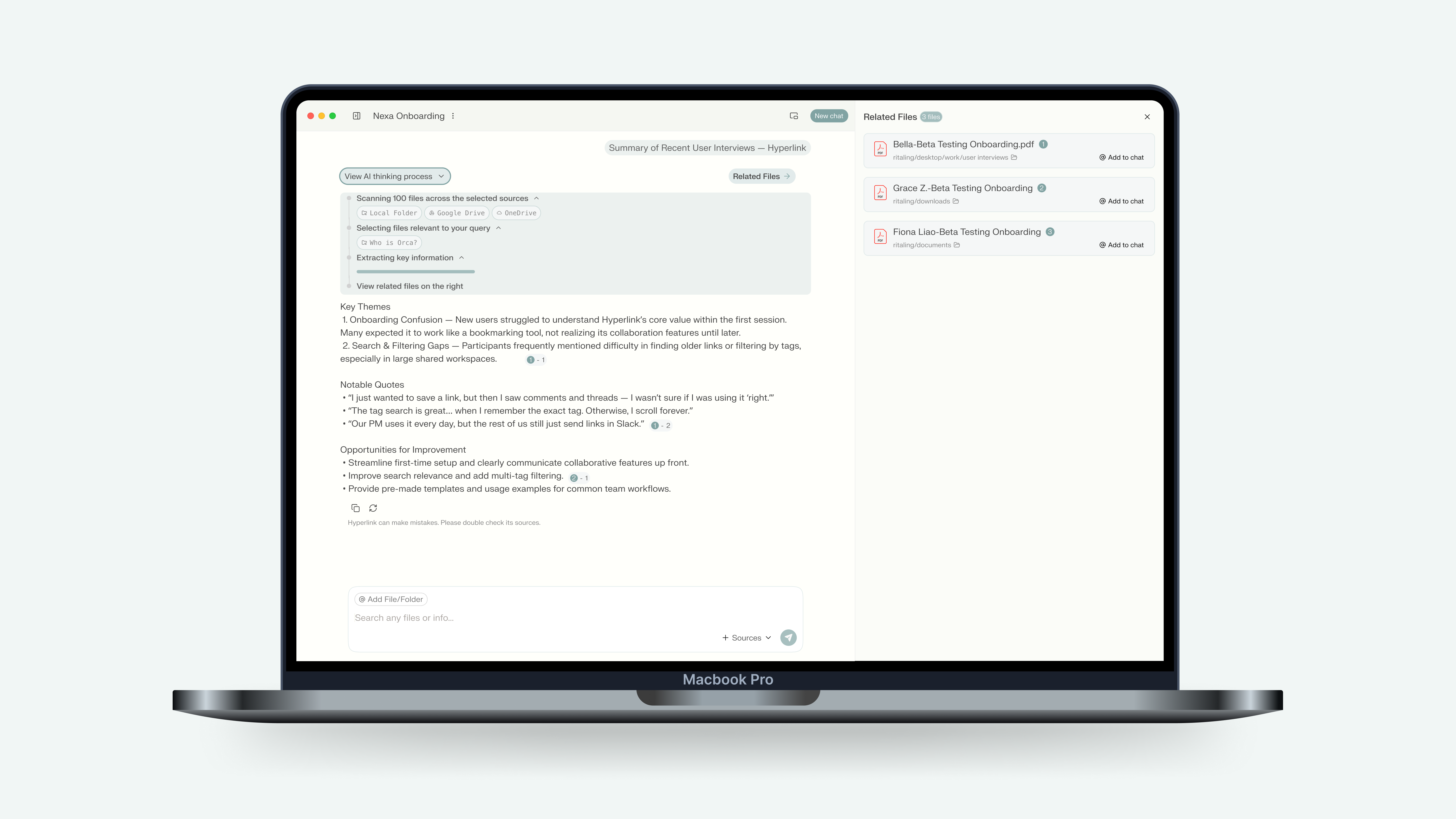
Hyperlink was designed as more than a tool to store data — it’s a digital second brain. In a world overflowing with scattered files, fleeting thoughts, and disconnected apps, we aimed to create a product identity that feels both human-centered and emotionally resonant, while also providing clarity and structure.

How Can We Design a System That is Both Warm and Empathetic, Yet Grounded and Analytical?
The main challenge was to resolve a tension: users need Hyperlink to feel like a creative companion during brainstorming, while also acting as a strategic partner when organizing and analyzing.
We needed a brand system that could flex between these two mindsets, without losing coherence.

AI That Understands People, Works With People, and Improves Our Lives
Inspired by Fei-fei Li’s vision of human-centered AI, we grounded Hyperlink’s brand in empathy. This principle guided both the tone of voice and the visual identity: approachable, intelligent, and deeply collaborative.

Color Is the First Emotional Experience
Color became the cornerstone of Hyperlink’s brand. Beyond aesthetics, color influences how users perceive intelligence, trust, and comfort. As Kandinsky said, “Color is a power which directly influences the soul.” We used this principle to build themes that match user mindsets and emotional needs.
Two Emotional Worlds
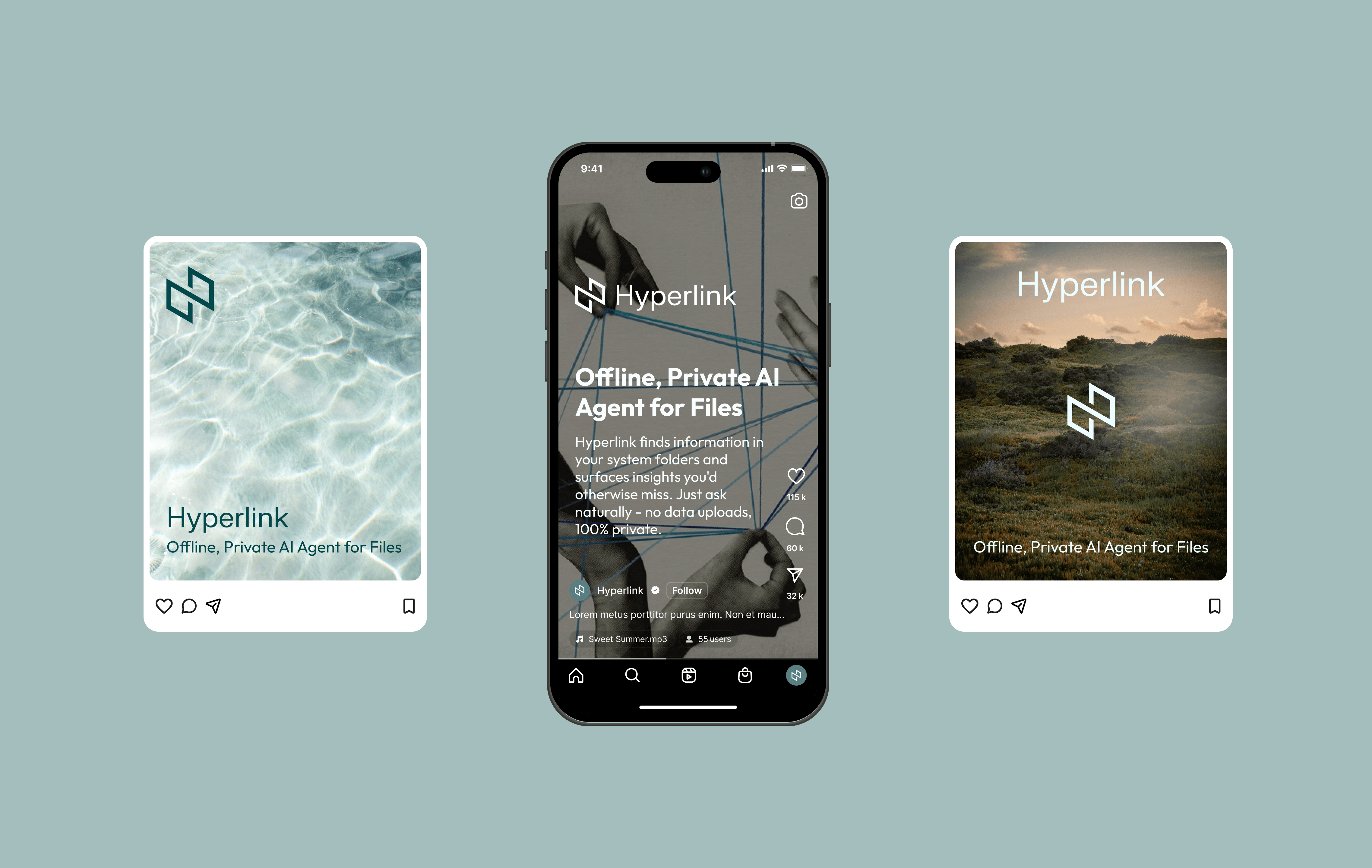
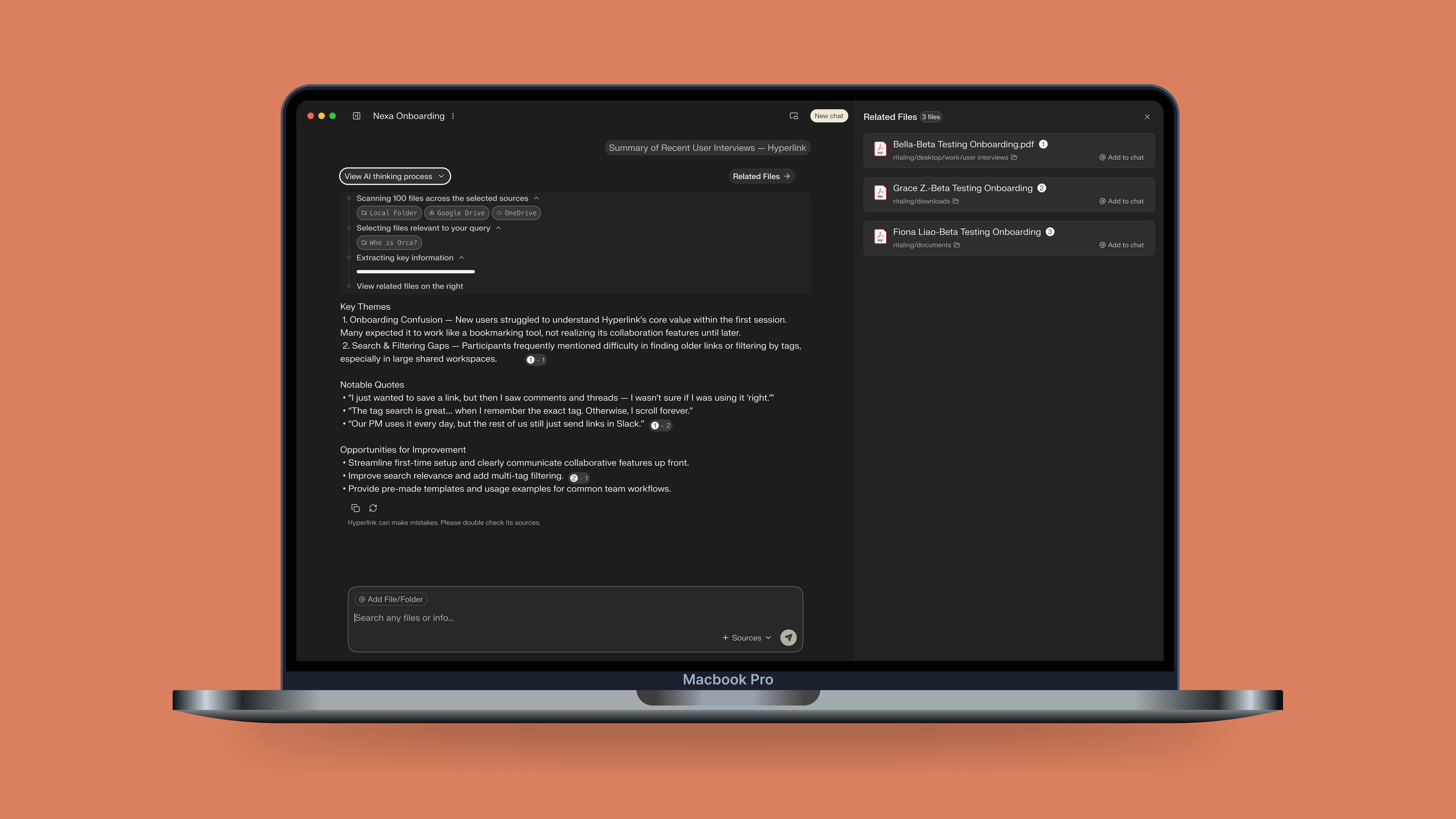
Coral Sunrise: The Warm Companion
Coral Sunrise embodies creativity, warmth, and human connection. It’s expressive and empathetic, designed for moments of flow and brainstorming.


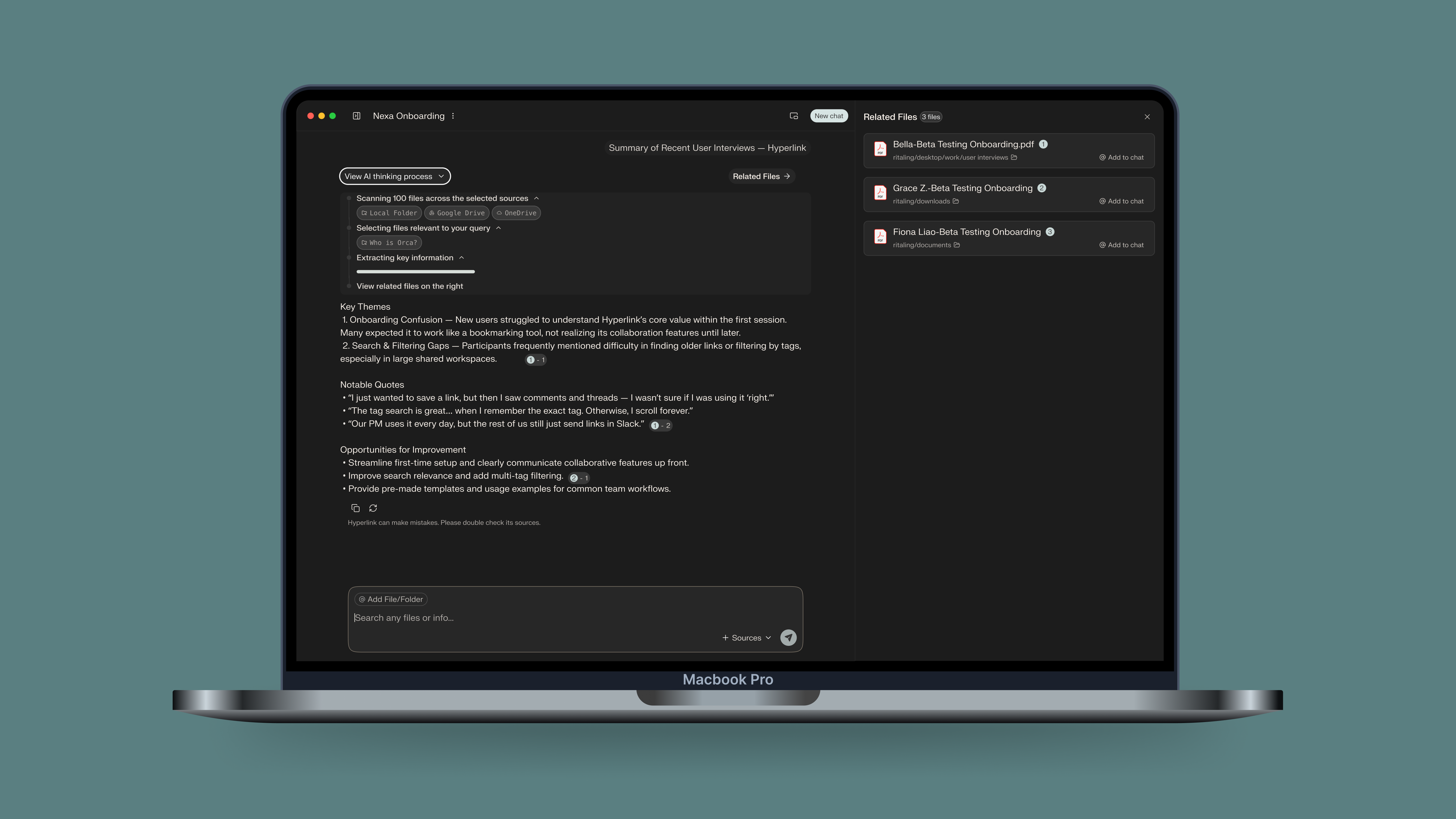
Dusty Mint: The Quiet Strategist
Dusty Mint represents calm clarity and grounded analysis. It’s rational, balanced, and structured — perfect for organizing and planning.

More Than an Identity — A Feeling of Trust and Flow
The branding and design system achieved three key outcomes:

Designing With Emotion, Not Just Function
This project showed me the importance of weaving brand values into every design decision. By starting from human needs and emotional cues, the final system does more than look beautiful — it builds trust, invites creativity, and adapts to the user’s state of mind.

Consistency
•Design debt reduced
•Single source of truth

User Resonance
User feedback: "“Calm, focused, trustworthy.”

Scalability
With the design tokens, ↓ 45% time to implement new component
.png)
%20(1).jpeg)

